This annoys the little OCD Meanderer stuck inside my head. Greatly.
Hell, if we're talking about annoying little changes... even the fact that Changes is a hardcover, when the rest are small paperbacks really, really irks me.
However, as you all know, the name of that novel is Changes. It would be resoundingly stupid of me to say that the people who make the decisions on covers made a huge mistake by changing it.
Except... well, then again the cover for Changes is kind of following the whole scheme of "case file" covers like the previous books. But then you look at Ghost Story.
It's despicable.
I've posted the cover before as a part of the "it's coming!" overjoyment post. But here it is again.
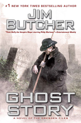
This change in style is disappointing. It's very reminiscent of usual American covers... and by the way, this is the US cover, but the one over here is exactly the same, with a different font for Jim's name and the title... and they're both at the bottom and Jim's name is red. Okay, okay... so it's not exactly the same. But, it might as well be.
US book covers are not the type of thing I like on my books. I think that the UK covers are much nicer. Sure, there isn't usually as much going on as an American cover, but I like it that way dammit!
Oh, hey, I found the UK cover:

Well, look at that! I didn't see it last time. Right, so, as you see... not a huge difference. The image is closer, and the font is both red and blockier. Also, the colour is different. Which makes me sound like I know nothing about it... but the image has a cyan overlay for some reason. Perhaps it's to oppose the red "JIM BUTCHER" more?
But, then again... wait, I see. I see the reason. Okay, look at the covers again. You can see that in the US cover, the plant is green, the gravestones black/grey/white and Dresden is wearing a black duster and has a wooden staff and has skin... but does he? Nope. In this book, Harry is a ghost. As readers of the previous book will know, and people who can see into meanings behind titles even just a little bit.
Now, look at the UK cover. The blue tint to the image can be seen as an attempt to show the scene in an "otherworldly" light. Literally, they are trying to show that Harry is now a ghost by using a colour that we have all seen ghosts appear in... on TV and in films. You know the thing I mean, where the character appears and is transparent and has a highly cyan colour scheme going on?
Well, the colour change is cracked. Now, just to figure out why they changed the series' style half the bloody-well way through?
Anyways... have a gander at the cover difference between an earlier book's US and UK editions.

The UK one, above, and the US, below.

Alrighty then. So, I never realised that the Ghost Story cover is basically just the US scheme... and by the way, I have no idea if the Storm Front cover I have is the first edition, or whatever. But, you can see by the UK cover that it's vastly different. And, in my opinion, much better.
The simple style, a single tag line that could be used as a slogan, minimal use of colour, strategic placement of the blood splatter (there's a different addition to each cover, usually relating to the story), and a signature-style font for Jim's name... all makes for a simply interesting book cover. You can do a similar kind of thing for the Codex Alera books by Jim too, the US covers have guys dressed in Roman Legion armour doing some scene from the book... Whereas the UK covers have a symbol for whichever element is being used for that book (there are six elements in the magic system, fire, water, air, earth, wood and metal - coincidently, there are six books), and there's a small image across the top... but the majority of the cover is black, with coloured writing related to the element. Very nice.
OH, and pet peeve number one thousand... DO NOT use images on the front covers of books when they have not FULLY complied with the image of the character as portrayed by the creator. In this case, Jim Butcher created Harry Dresden and Harry does NOT wear a cowboy hat. However, the marketing guys know that he looks "cooler" to the masses that way, so they give him one on the covers.
In Ghost Story, Jim even mentions the hat thing... and both he and Harry reject it, again!
Argh.
I hate how they impose these character images onto us. Especially as the artist isn't Jim Butcher. Some authors don't even like giving concrete images of characters, because they know that some readers prefer their own creations in their own minds. Obviously, you need traits and some tags for characters, but that's more of a writer's job than reader's... and I'm getting well away from my point.
Ghost Story changed the scheme. I do not like this. But, the book is amazing. I'll write the review now and either put it up today or tomorrow after a little edit.
Sorry for the rant-like post... but, we all have things we don't like. This is one of those things for me. I'm sure other people don't like it too. I'm sure there are some American readers who hate British covers, cause they aren't eye catching enough. But, I don't think the whole "OH PICK ME!" type of covers are good for the book. In general. But, that's another topic, for another day.
Read well, folks.
No comments:
Post a Comment